Part 2 of this assignment involved integrating the hand drawn image from Part 1 with photographs of the respective object in order to create a professional quality, multi-layered image in Photoshop. Various techniques in terms of blend modes, filters, etc were to be utilized. Auxiliary pieces, such as texture, brushes or complimentary imagery was also to be incorporated.
My Design Log
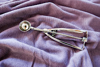
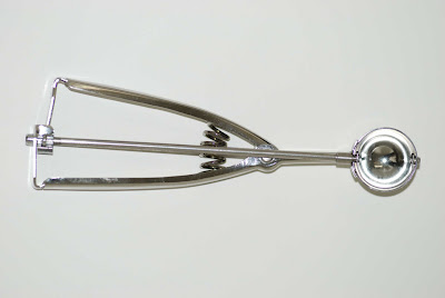
 I started with the photo of the ice cream scoop on purple textured cloth. I first applied a black and white sepia toned adjustment layer to the original image and dropped the opacity down to about 90%. I set my foreground to a creamy color and my background to a medium sepia, duplicated the layer and applied the "Difference Clouds" filter. I lowered the layer opacity to 10% just to give it some depth and age to start. Next I applied various opacity and fill settings to 2 different layer of "grunge" brush strokes to further age the piece. I added a layer and rendered clouds at full fill and opacity but blended for saturation only to enhance the depth. Next, I incorporated my 2nd photograph by extracting the ice cream scoop, scaling it to the appropriate size to tile in the composition, rotating it and the duplicating it four times in a row X3, before grouping all the images and applying a screen blend to the group.
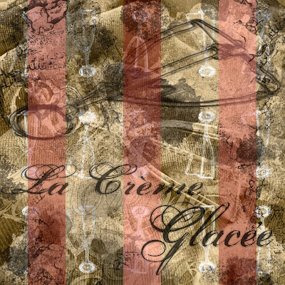
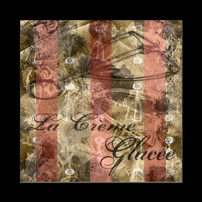
 The final elements in the image were the hand drawn image, of course, which was duplicated twice and blended to multiply, with various artistic brush filters and blurs applied. Three vertical lines were added at an opacity of about 40% with a gradient that alternates from line to line. Finally text was incorporated, using a grunge script, with a subtle underlay that was enlarged and the overlay that varies in opacity for depth. A top layer of black grunge brush strokes in various shapes, textures and other dynamics was applied at about 60% opacity.
The Final Image


No comments:
Post a Comment